Project Process: Manchester Family Room: Exploring Options Part 2
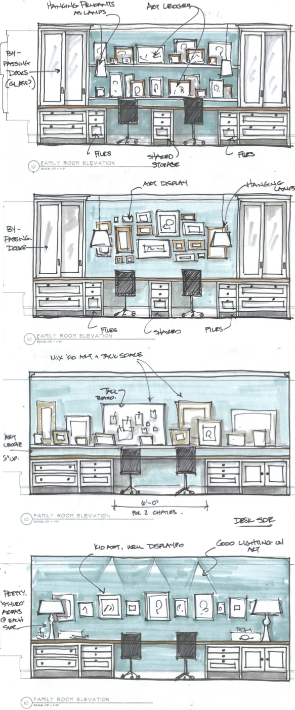
Following up my last post I wanted to share the process and development of the desk area side of the Family Room. Here we did the same thing with the client – explore different functional and aesthetic goals. Having room for plenty of storage and displaying her kids art were two driving forces. Below is my quickie sketches showcasing a variety of ways we could achieve this, some with more storage than others.
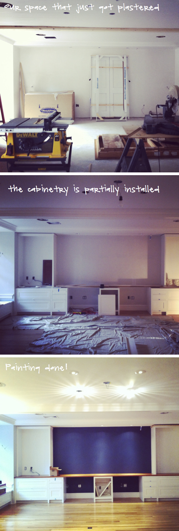
Some photos below of the progress. Like the TV wall side we were able to get the cabinetry installed and then take a step back and think about colors – in the end choosing to use the dark navy was a wall color so that any art that was added after would pop out against the dark back.
Architecture by Art Dioli of Olson Lewis , GC is Carl Anderson Contracting and cabinetry but David McWilliams.


