Project Process: Manchester Family Room – Exploring Options Part 1
We just put some new professional photography up on the web site of a local project in Manchester and I realized we never shared any of the development! We shot the kitchen recently for Boston Magazine Home and as I was pulling out some specs I came across my sketches of cabinetry options in the Family Room. Amazing how many options there can be and what we end up settling on!
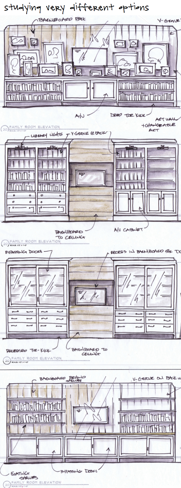
Below are some studies of the TV wall – where we had some different goals to explore – some ideas were about camouflaging the TV with art and others were about adding lots of shelf storage in varying cabinetry styles. Also somewhere in the Family Room we want to display a bunch of her kids art in a changeable, easy way. Hence one of our first options below we played with the idea of integrating the TV into a wall of art and photos with storage below.
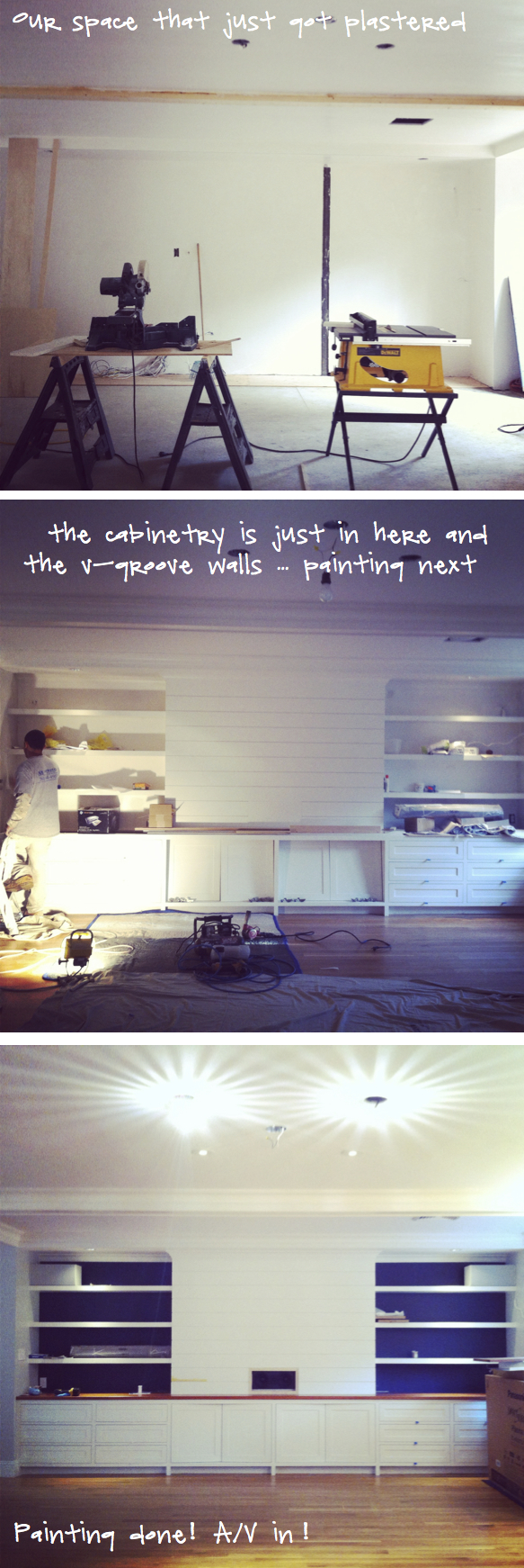
Not that progress photos are the most riveting to look at – but here are some photos showing the space just plastered and then our transition into the space having the V-groove up and cabinetry in. When we got to that point we had many discussions on wall color, cabinetry color, the idea of an accent color in the backs of the cabinets for dimension, etc etc. We settled on a dark navy in the cabinet backs that we’d repeat the color in our furnishings. Will share finished pics in a next post!
 Architecture by Art Dioli of Olson Lewis , GC is Carl Anderson Contracting and cabinetry but David McWilliams.


