In the Press: Our Design for Delta’s Ad
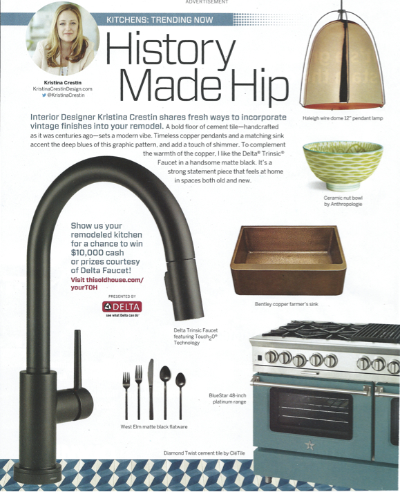
Recently I got asked to do a fun little project for Delta. I had to pull together a kitchen design. Basically a mood board – a design with no client involved – freeing! At the end of the day I didn’t go as crazy as I expected but it was a fun exercise. Below is the Ad that ran in This Old House Magazine, which like all design projects ended up being a variation of the initial design.
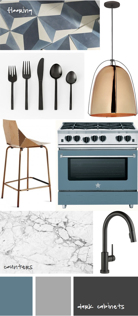
 Below is the 2nd variation I was working with. It all started with the Trinsic faucet in matt black. We’ve been using allot of matte black lately and I’ve always wanted to pair it with this great copper and black fixture from Rejuvenation. Most clients have been hesitant to utilize copper, wondering about it’s longevity as a trend (and we have too). So of course since this wasn’t real life I went with the copper idea. Classic marble, dark grey cabinets and a fabulous patterned floor tile all make a nice backdrop for copper accents to sparkle. Not to mentioned a colored range …. one of my current obsessions …..
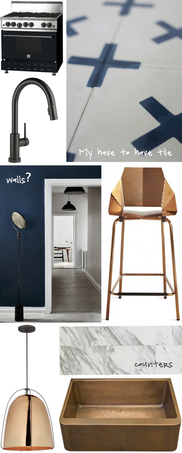
This last vignette was where I started with my design, loving this graphic tile. The rich blue tone with copper was just a lovely pairing, especially rounding it out with the matte black faucet and a black range. Done! I’d take it. Too bad doing my kitchen isn’t in the cards ….. This grouping didn’t make it to the cutting board as they wanted some more color for the ad, which is why the design morphed into the one above and then in turn what ended up published.
Product sourcing: Faucet – Delta Trinsic in matte black, Sink , Rejuvenation – Haleigh Wire Dome Pendant, Range – BlueStar Cooking, Silverware – West Elm, Blu Dot Copper Real Good Counter Stool, Tile – Popham Design.


