Beals Project: A Black Rug in the Bedroom?
So I said to Jon ‘hey I want to show you this almost black rug’. Imagine the face. I love going on the design journey with him. This Bedroom is tight – think original farmhouse proportions. Once a decently real closet that actually fits hangers is added it gets even tighter. Off center windows – things you can imagine that makes my designer brain want to explode. Playing with the proportions of the room we went for a low modern bed intentionally set in front of the windows – the driveway is right behind that window so it actually helps with a sense of privacy. I felt like the room needed a darker color to ground it. Hence the almost black!
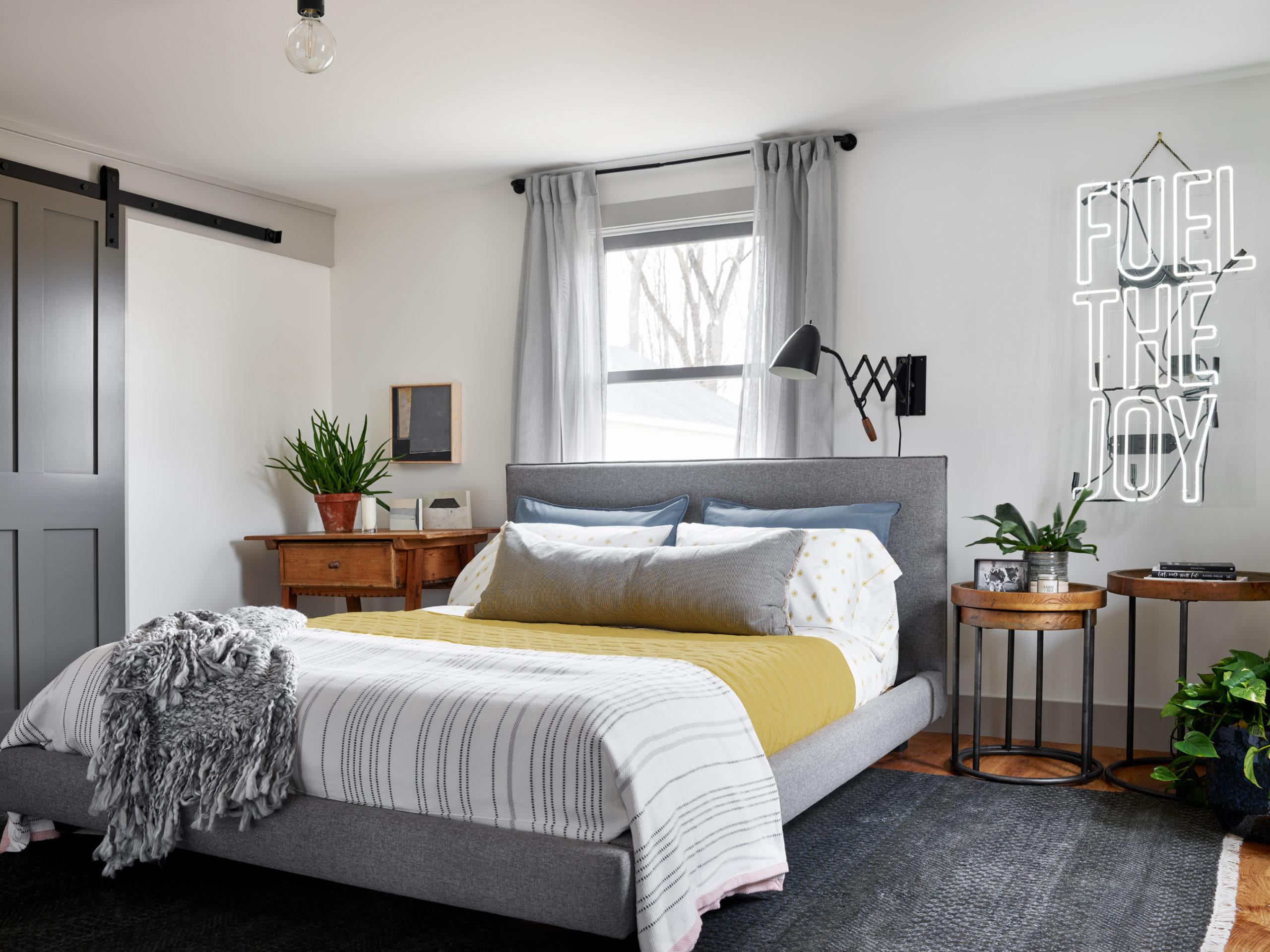
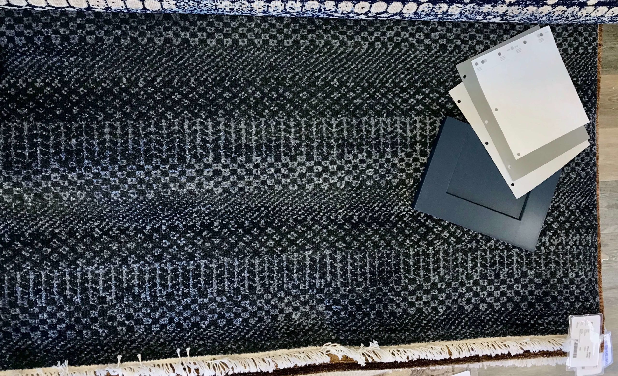
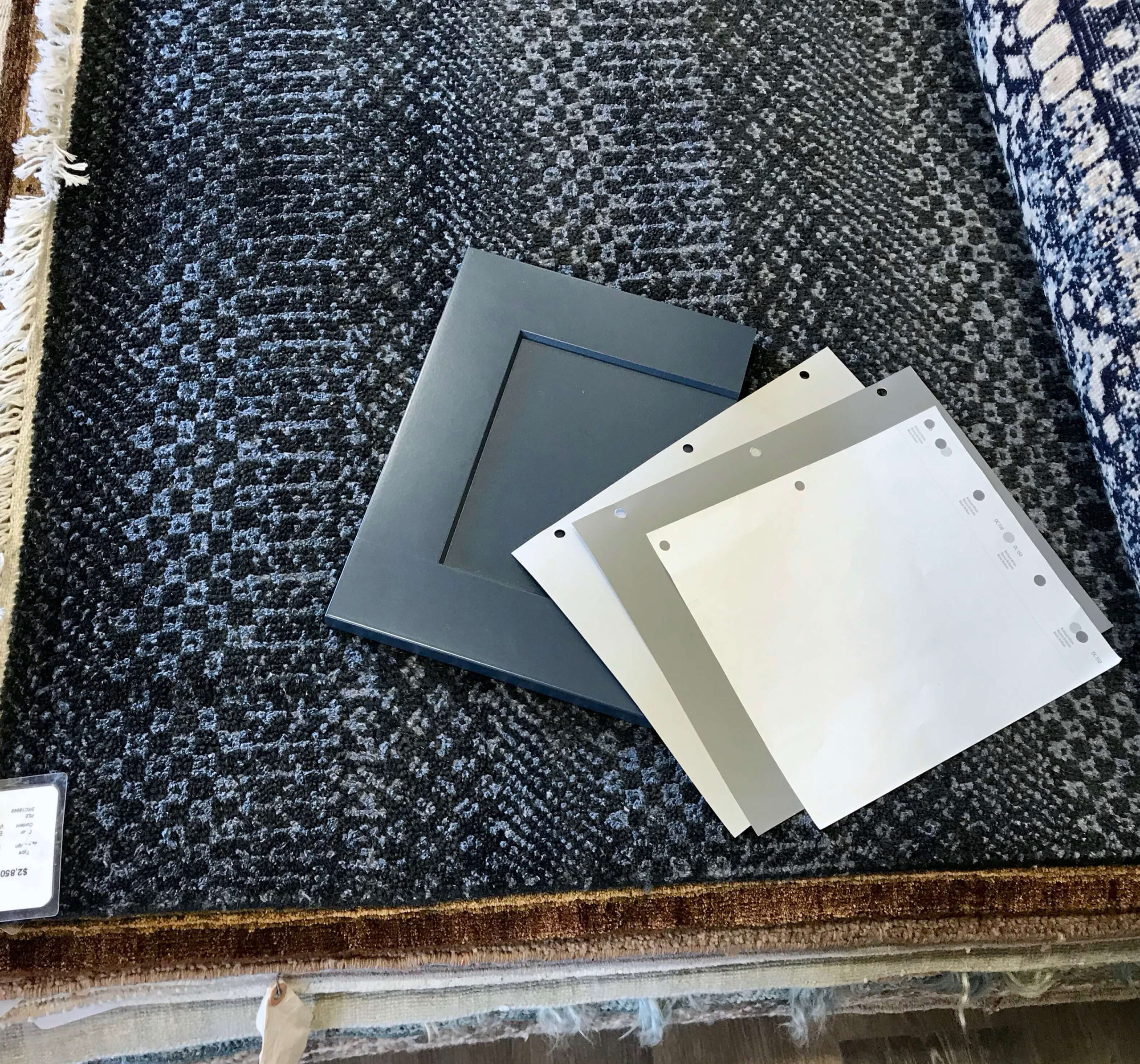
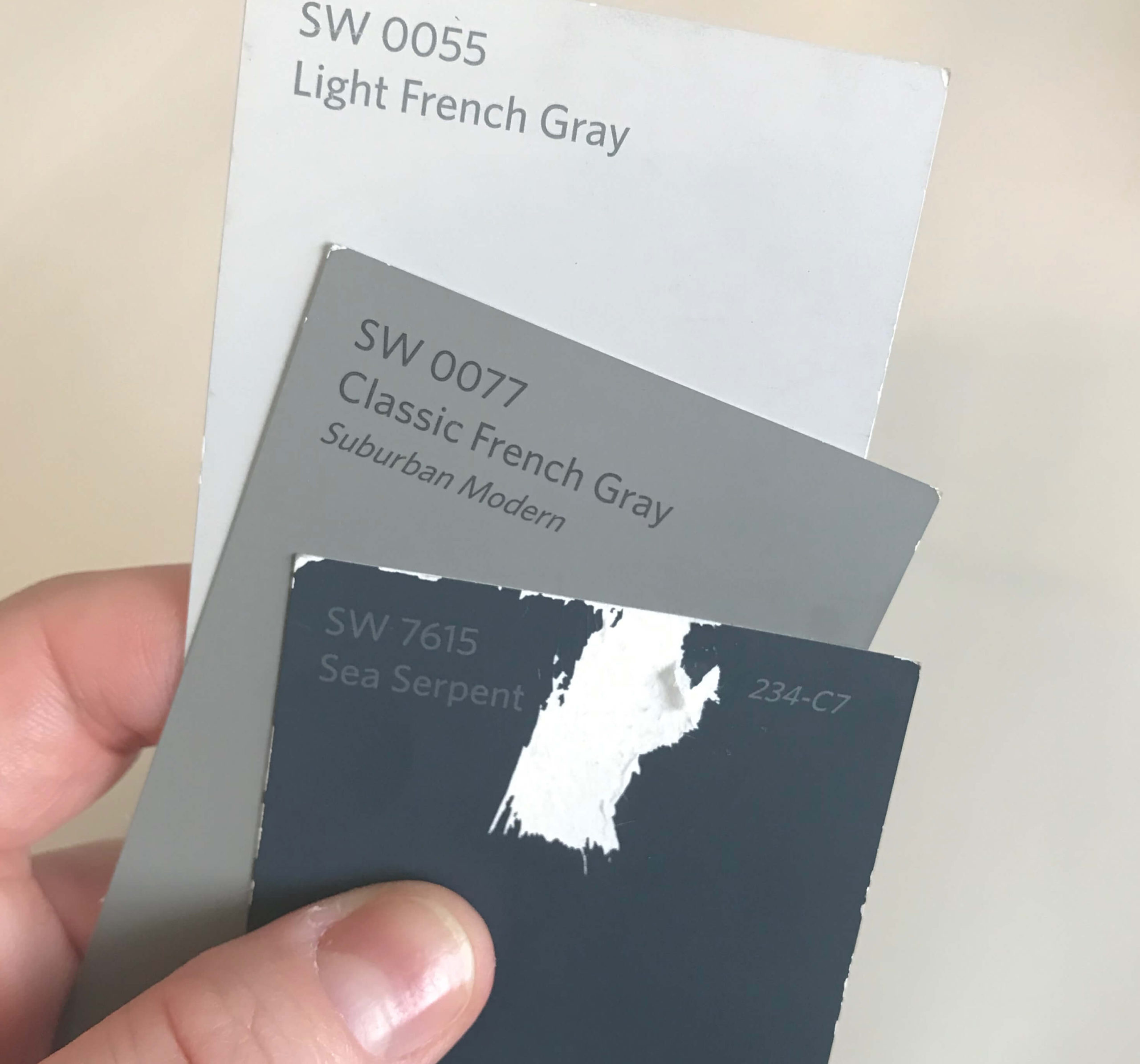
So close up – its actually a combination of black and blue. I love the small patterning. I brought the paint colors and the Kitchen cabinet door sample as well to check the blue tones. I love a pattern scale like this that from afar it doesn’t read as much of a pattern but close up has much more interest. It doesn’t compete with anything in here, which was the intention.

Resources:
Rug: Landry & Arcari
2 Left beside table art : Alyssa Grenning
Left beside table art on wall: Deborah Baskin
Neon Sign: Maureen Gambale
Grey Bed: CB2
Throw Pillows: CB2
Yellow Coverlet, Sheets & Long Pillow: Target
Knit Blanket: Ugg
Drapery Rod: Target
Drapery: West Elm
Ceiling Light: Leanne Ford for Target
